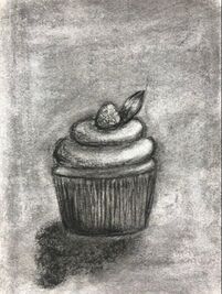
1. I think the most helpful warmup was the sign language A. It really helped me learn how to draw with more dimension but it also was a fun challenge. 2. Compisition is the placement of an object and value is the dimension that makes it look more life like 3. I really love how easy it was to blend the charcoal but it was a very messy media. With pen it looks really cool but takes time and is not always my favorite style. Pencil looks really nice when blended but can be blended to much if you accidently drag your hand along the paper. 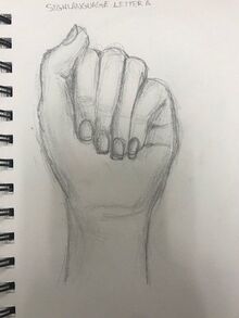
0 Comments
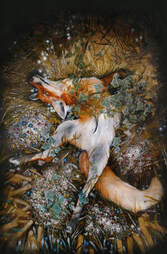
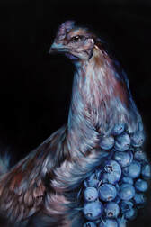
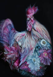
Art created by - Grace Ebert Grace Ebert is a Italy based artist Material used - Oil on board
Her Website - www.graceebert.com/ Grace Ebert's Art really inspires me because I love all the details she uses in her paintings and I also love surrealism so I think how she mixed different things together is really cool. In the first chicken painting I like that she used the same color of the blueberries on the feathers so the whole peice looks really put together and on the second chicken painting she once again used the same colors as the flowers but she also blended the flowers in to look like some of the same texture as the chickens feathers. I also love foxes so that is why I included the picture of the fox and I like the way she made it look more realistic but still magical and whimsical at the same time.
|