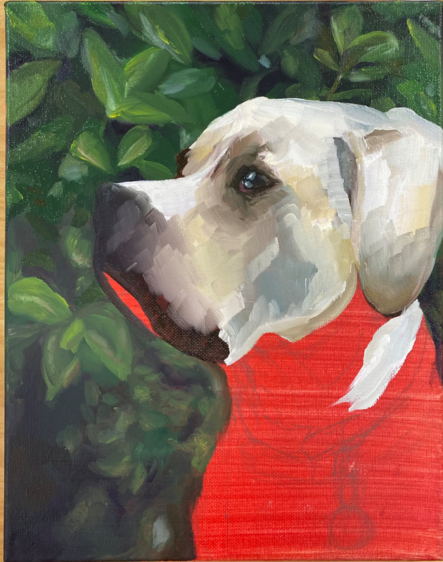
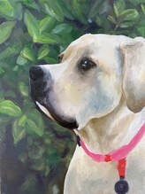
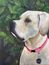
Pet portrait painting
|
|
|
|
|
|
|
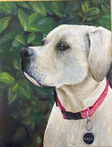
1. I feel that my painting is neat and includes lots of colors and has good craftsmenship for fur which I'm not use to painting.
2. I use lots of colors for the effect of fur and dimension in Nala so she doesn't look 2D
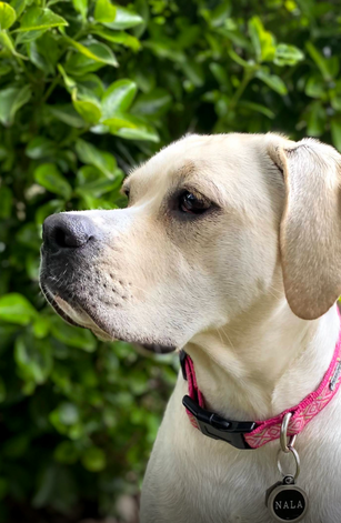
3. I chose to paint my dog Nala. I don't paint animals and I thought a dog with fur would be a good challenge
4. The focus point is my dog which is also the reason for the blurry background to give the effect of the background but keeping my dog as the main focus point
5. I used texture by layering strokes of paint to resemble hair and lighter colors on top of darker colors to give the illusion of texture
6. My researched helped because I looked at the way other people painted fur and the different colors in pictures of real fur
7. Oil is my personal favorite medium to use because I think it is the easiest to work with about blending, layering, and how it doesn't dry as fast as acrylic.
8. I had trouble desciding which way I wanted to go with this because I had one version where the paint was more in strokes of color without clear stokes of of hair but I did end up going into more detail to show the fur on Nala.
2. I use lots of colors for the effect of fur and dimension in Nala so she doesn't look 2D
3. I chose to paint my dog Nala. I don't paint animals and I thought a dog with fur would be a good challenge
4. The focus point is my dog which is also the reason for the blurry background to give the effect of the background but keeping my dog as the main focus point
5. I used texture by layering strokes of paint to resemble hair and lighter colors on top of darker colors to give the illusion of texture
6. My researched helped because I looked at the way other people painted fur and the different colors in pictures of real fur
7. Oil is my personal favorite medium to use because I think it is the easiest to work with about blending, layering, and how it doesn't dry as fast as acrylic.
8. I had trouble desciding which way I wanted to go with this because I had one version where the paint was more in strokes of color without clear stokes of of hair but I did end up going into more detail to show the fur on Nala.
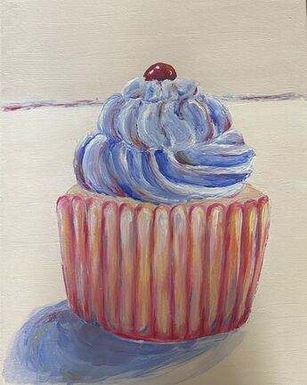
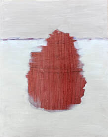
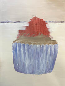
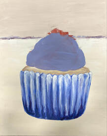
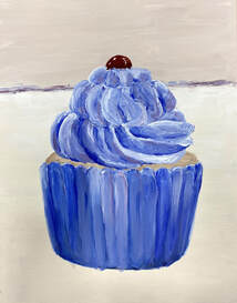
Wayne Theibaud Painting
|
1. I feel the craftsmanship could have been a little better with lines and proportions but overall was painted decent
2. I used thick paint and a pallet knife to try and create the same look Theibad had used in his paintings 3. I used lots of complementary colors in my painting to show dimension and values 4. The main focus point is the cupcake 5. I used texture in my painting my building up thick layers of paint to resemble frosting 6. I just used the same colors on the side for the border 7. It was a bit hard to get the thick layers with acrylic paint since it can sometimes be more on the liquid side but I just ended up using more colors. |
|
|
|
|
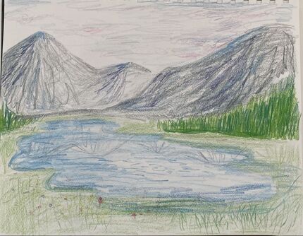
watercolor final painting
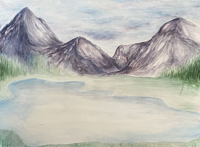
1. I used the techniques of putting wet watercolor on wet paper or putting the watercolor on dry paper for a more strong color
2. Using transparent layers was very important. In watercolor you cant really go back so you have to use light layers and then build on top of that
3. I tried to make the composition work by filling the space and not leaving to much sky or grass.
4. Color choice was important because you have to add in other colors you may not see in real life but add them to your art for a more realistic look.
5. I used light layers to build up colors and used different techniques I learned in class to help me
6. I would just add more. I feel like its lacking more or more color that could have made it less boring.
7. I have learned that watercolor is not as easy as it seems. Once you put down some color its pretty much stuck there so you have to have an exact plan
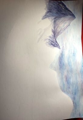
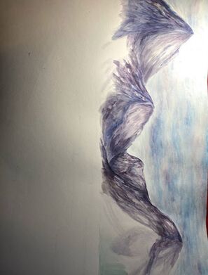
watercolor in progress
|
|
|
|
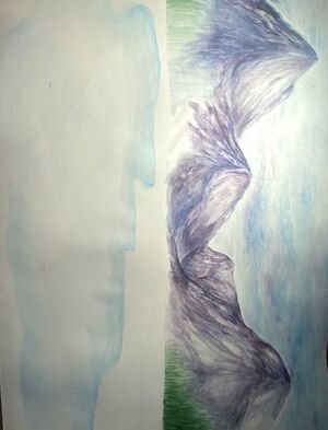
watercolor final sketch |
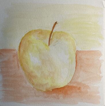
Watercolor Fruit study
|
|
|
|
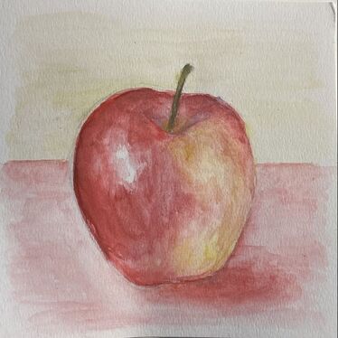
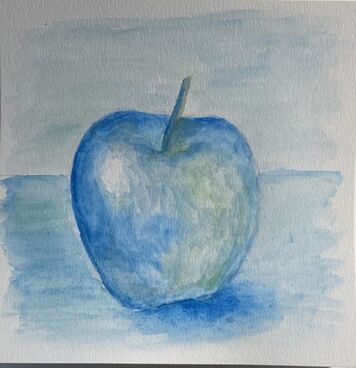
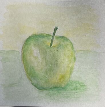
These 4 apples where done with watercolor and different techniques I learned in class. I used other colors to give more depth and make it look more realistic.
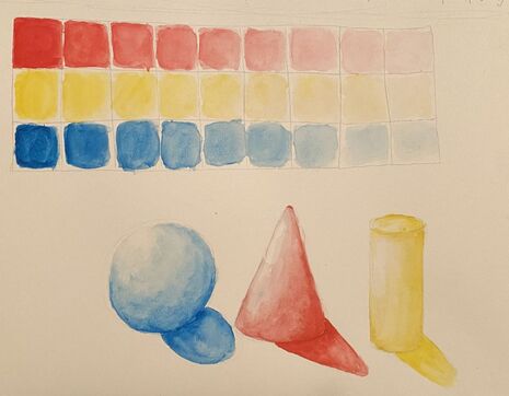
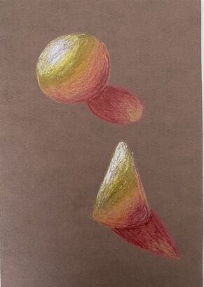
Watercolor value chartand forms
|
With watercolor I tried to built up color and lightly paint to make a value chart of gradient colors and then used that to help me paint the forms.
|
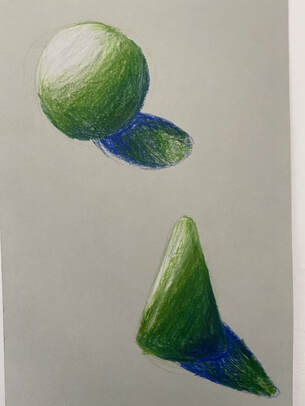
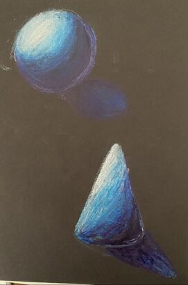
colored pencil forms
|
|
|
These were the colored pencil forms I made. I do feel like I could have done better and possibly blended it more but I used different colors to show dimension in my art.
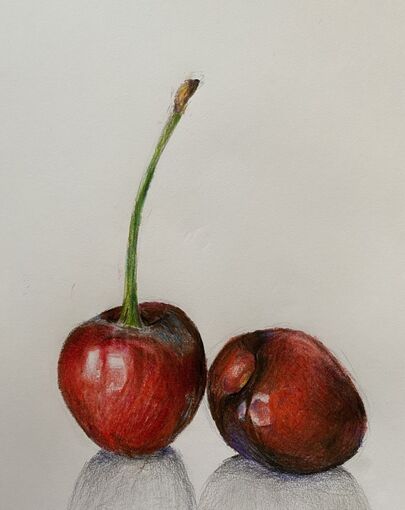
Colored pencil Fruit
|
I decided to draw the same cherries I did in drawing last semester so I could see my improvement. I used more colors and left more bright sport to make them more realistic to the picture.
|
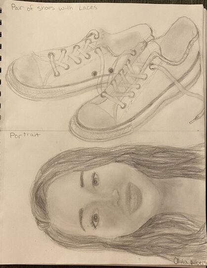
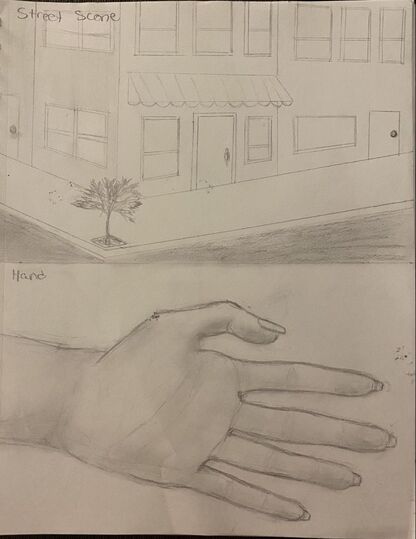
4 Assessment drawings
|
|
These 4 drawings I made in the beginning of sophomore year and I used a regular pencil to draw this
