Clay food sculpture
|
1. I think I crafted all the little fruit piece nicely so they look neat and realistic. I spent time adding detail to every fruit after making roughly the right shape
2. The most difficult part of this project was adding in the details into the clay and then getting the paint colors exact to the real color of the fruit. I had to paint the clay afew times to get it to a point where I thought it looked right. 3. For the fruit I used my fingers and small clay tools to shape the clay but with the bowl I rolled a slab, placed it over a bowl for the same shape, and then added on a base. 4. My colors I used I think turned out pretty well. I payed attention to detail and matching my colors to reference photos 5. I would say this piece is interesting from all views. The fruit is not attached to the bowl so you are able to move them round and i made sure everything was painted so there weren't any unfinished spots 6. Making a sculpture is more complicated than it looks. You have to think about how your piece would look from every side and you need to build instead of drawing on a flat piece of paper 7. I created texture in my clay by taking very small clay tools to gently carve the ridges of texture of fruit and then added different colors of paint to appear like the fruit has a texture 8. I think my sculpture looks pretty realistic and that if someone were to look at it they would know it was a bowl of fruit 9. Researching pop artist inspired me and got me really excited to do this project. I got to see different types of foods made and I loved the way it looked when there were many different parts to the final piece. I wanted to be able to almost to move it around and take the fruit out 10. If I were to do this project again I would make more fruit. I wish that I had more so the bowl was more full |
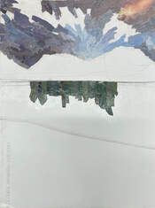
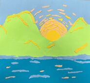
landscape painting
acrylic painting practice
|
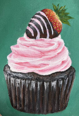
For this painting I practiced using different colors and many lights and darks to show value in the cupcake. When I paint with acrylic I normally place down the key colors and then later go paint back over it with smaller details.
|
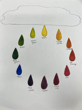
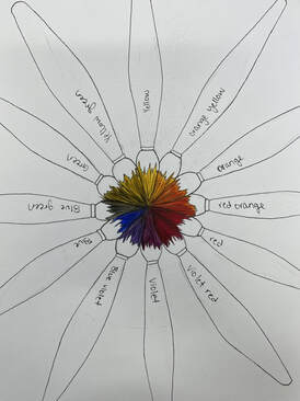
color wheels
|
|
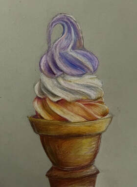
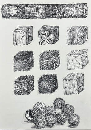
colored pencil practice
|
I
|
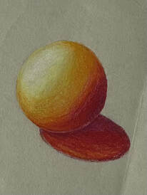
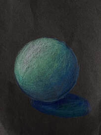
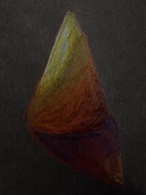
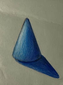
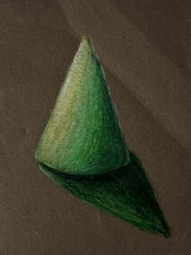
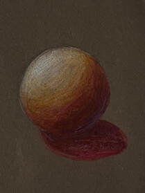
colored pencil forms
|
|
|
|
|
|
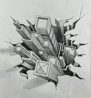
Pen perspective
|
1. For this project I basically outlined everything and then went back in with stippling throughout the piece to show the values and shadows
2. I used perspective by making a landscape and having the path in the middle of my drawing trail off into the distance 3. Texture is important in my composition because using pen you need to include texture to show depth and I wanted my art to look less 2D and adding texture makes it stand out more 4. Value is important in this project because pen without value looks like just an outline. Before i started adding stippling my piece looked unfinished until I added value 5. I think the craftsmanship is decent. I wish it was crumpled at the top but other then that and a few mistakes I think it was crafted nicly 6. If I were to redo this project I might just slightly change the composition and make sure I places plants and trees where I wanted them 7. I was inspired by Alice and wonderland for this piece and the girl in the middle is actually suppose to represent Alice. I wanted it look look magical and mysterious just like the movie and include whimsical mushrooms and glowing lights 8. It's important to use the pen techniques we learned in class because using a messy pen technique could possibly ruin a piece. What we learned in class I feel mae my art look more organized and finished 9. I learned a good bit about using pen from this project. I didn't use pen often as an art media but now i want to do more art like this |
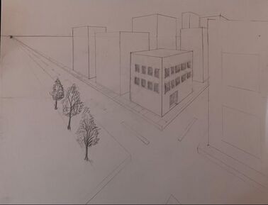
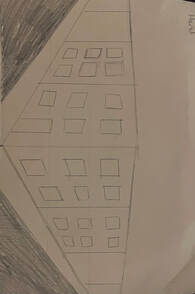
3 point perspective
|
This assignment taught me to draw 3 point perspective by following a video. I used a point in the far right corner and a ruler to draw my buildings straight and make sure my lines were accurate. I learned that in 3 point perspective shading is different then 1 and 2 point perspective and very important to give off a realistic look.
|
2 point perspective
|
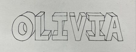
1 point perspective
|
For one point perspective I dew my name in all capital letters and then drew lines form the corners back to the same point.
|
Pen practice videos
|
collage
|
1. I chose to make a sunflower field because I thought it would look nice with different colored and shaped pieces of paper
2. I made sure that my proportions looked right by making sure that the sunflowers got smaller in the distance and that the sky and trees are the right size for the landscape 3. I used many different types of paper but they all were solid colors so to show texture I had to using a variety of shades to show texture and definition in my art 4. I decided I wanted to use really small pieces of paper. Even though it made this piece take a long time to complete It gave my art more detail 5. I feel that I used a good range of values. I used darker colors to show depth and value through the landscape 6. The craftsmanship I would say is pretty neat but working with glue and paper can build up and make it stick out or give the paper a textured look if the glue is touched before it dries 7. If I were to do this project again I might consider using bigger pieces and then going in with small details and just make sure that im not layer to much paper on top of each other |
|
collage practice
|
9 compositional pictures
|
|
|
|
|
|
|
|
|
4 assessment drawings
|
|
|
|
